An identity and print experience celebrating the era of co-working for remote and hybrid professionals
To support the rollout of citizenM’s new co-working membership offer, I developed a visual identity and collateral campaign that celebrated the evolving role of hotel spaces as work hubs. Rather than a generic co-working campaign the platform drew on nostalgia and elevated 90s office icons to create a distinctive system that felt simultaneously playful and functional.
The work spanned printed materials, digital touchpoints, and physical artefacts distributed within hotel spaces, creating a cohesive experience for members.
-
As art director and designer, I developed the campaign concept and established the visual direction that underpinned all touchpoints. I also single-handedly designed and developed all print collateral. From deciding on print specs and creating proof of concepts for a complicated set of print pieces.
-
2 months

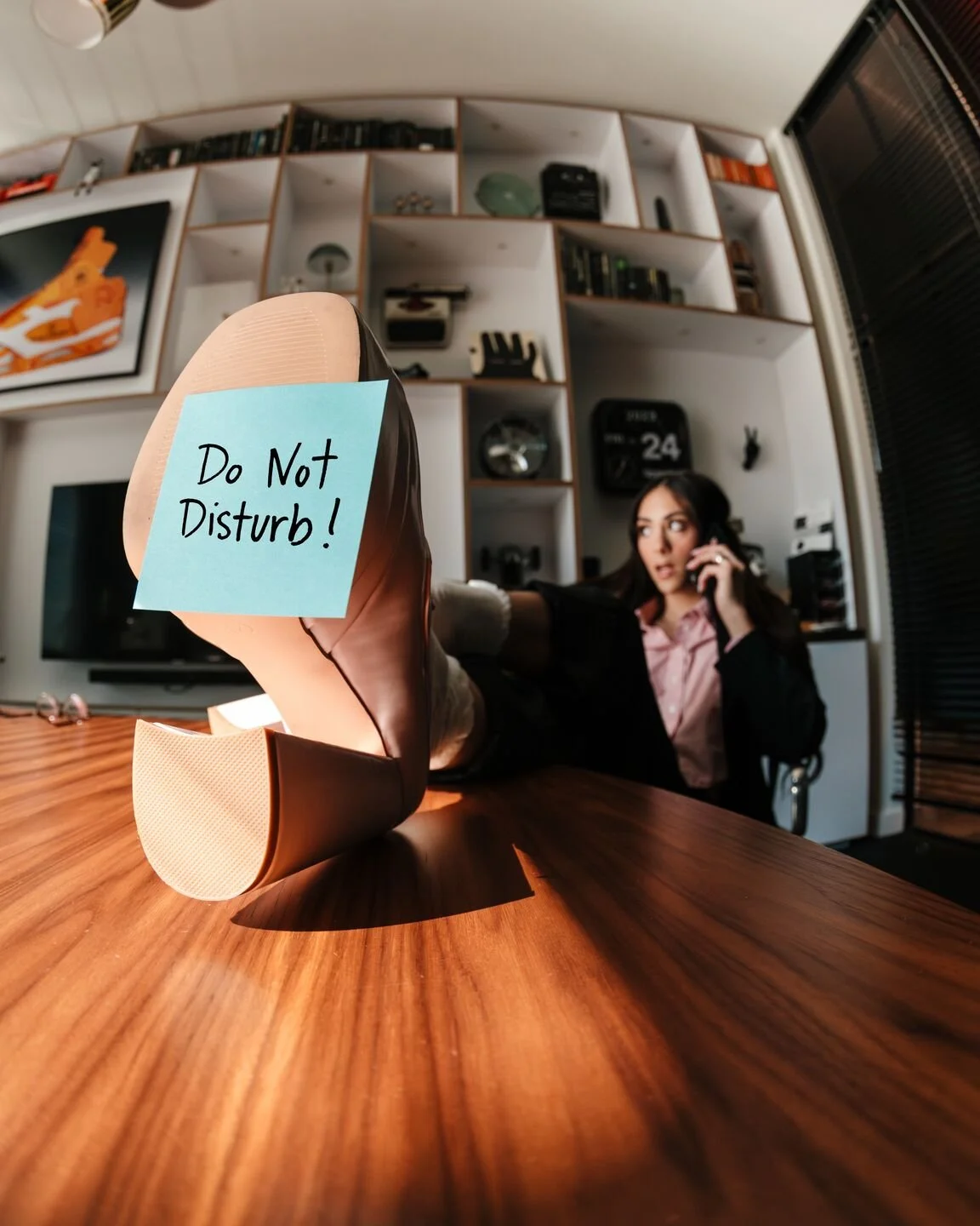
The brief was to develop a direction that would allow citizenM to stand out amongst a crowded market of other hotels and co-working spaces. Instead of relying on lifeless lobbies filled with people behind laptops, my vision was to showcasing citizenM's art-filled living rooms and cosy corners as the ultimate work environment.
The co-working identity had to work within the existing citizenM membership (mycitizenM+) essentially becoming a campaign within a pre-existing campaign.
One of the brand priorities was creating a visual world consistent enough to travel across formats. The same iconography and photographic tone that ran through the digital campaign was carried into the print collateral. Allowing the work to feel like a cohesive campaign rather than a collection of separate executions.
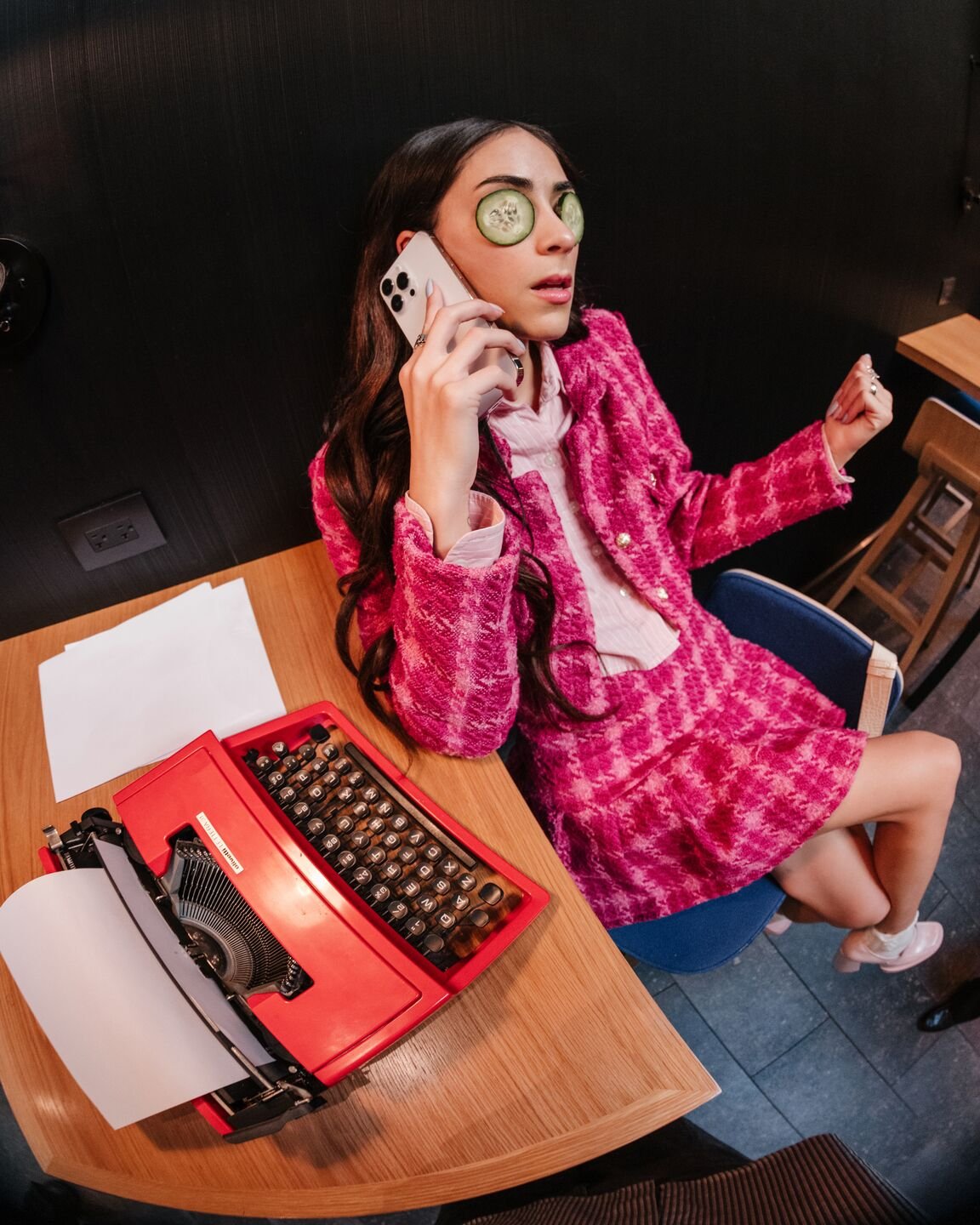
I focused on 90s office memorabilia like floppy discs, typewriters, and chunky phones as the core icons throughout the digital campaign and within the print designs themselves.
brand context


My art direction for the co-working campaign took inspiration from 90s sitcoms like Seinfeld and Friends, playing with colour and composition to create an elevated experience throughout. I experimented with depth and distortion for the campaign photography, creating an immersive world that felt dynamic and surreal with a strong editorial feel. The styling also had to play into this, we incorporated typically corporate pieces like tweed blazers and ties with high-fashion twists like corsets and raw hems.
The campaign photograpy was used across digital platforms and touchpoints but also within the print collateral to create a joined-up approach.
The print campaign was centred around a modular folder which housed the benefits and perks of the co-working membership and 'house rules'. The standout star of the collateral was the custom (and fully functional) floppy disc. Together with Amsterdam-based agency, Colourcake, we located a factory that was able to produce 10,000 branded floppy discs to act as the co-working ‘identifier’. This meant everyone who wished to co-work received the identifier, which signalled to hotel ambassadors that they had signed up for the membership and were free to work in the space.
So beloved by co-workers, many were stolen and we had to have them reproduced.
design and art direction